Shout & ANZ.
Shout donation form.
Research / UX / UI / Web
↓

Background.
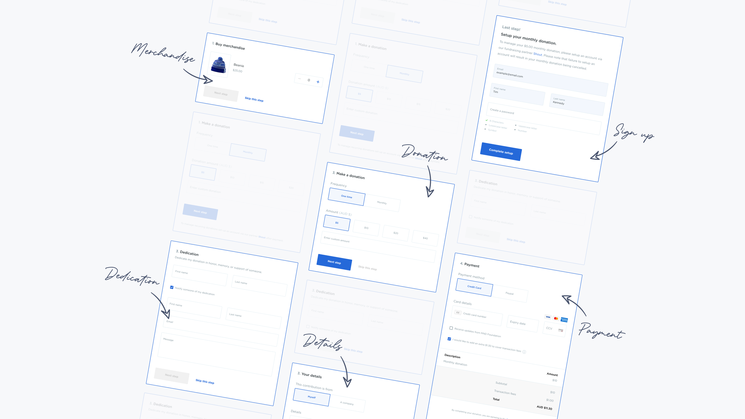
The donation form is a ‘plug-in’ feature that allows charities to take donations and sell merchandise from their own website. It processes payments, receipting and all administrative tasks needed.
I was tasked with leading the design with the aim to enhance the feature to better meet the needs of Shout’s users.
Donation form used for the Big Freeze 6.
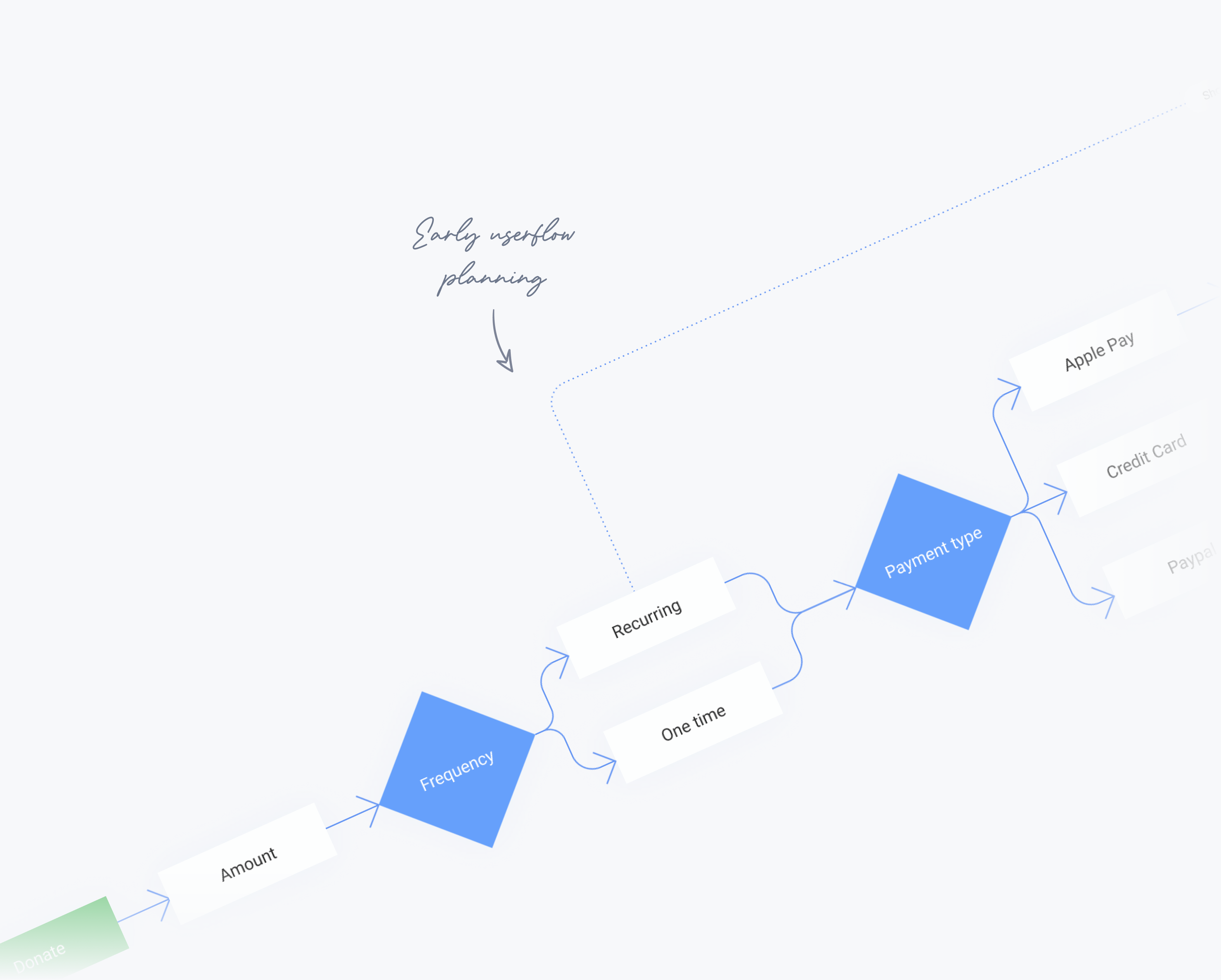
User flow mapping.
Approach.
User interviews and surveys were conducted across three points of contact; charities, donors and internal operations staff. Areas highlighted for improvement included: a more streamlined user flow, improved personalisation for charities and more flexibility for donors.
Custom theming.
To improve personalisation, a new modular layout was created to allow charities to create a stronger branded message through larger text areas, images and embedded video.
The custom theming filters down to custom form field sections that can be included or excluded depending on the charity’s needs.
New features.
Custom theme tools in the CMS.
Examples of use.
Streamlined user experience.
Mission statement.
Outcome.
By utilising research insights and user feedback, combined with modern UX practices, I was able to design a solution that could both streamline the donation flow and integrate new features, without overloading the experience.
The new design was released in May 2020 and first used for The Big Freeze 2020 campaign. Throughout the campaign our new donation form collected a total of $3.4m, up $1.2m from the 2019 campaign, where the old donation form collected $2.2m.
The project was seen as a success, particularly during Covid-19 lockdowns. FightMND expressed how the versatility of the new design had a bigger impact on donors by allowing them to convey a stronger branded message.


